/03
Case study · Oct 2017 — Feb 2022

Spaces
by Gloo.

A digital community platform fostering growth through small group interaction — end-to-end design lead from research through GTM.

Role

Mobile UX Lead

Focus

Community, small groups, growth

Platform

iOS, Android, Web (Flutter)

Timeline

2017 — 2020
2020 — 2022

01

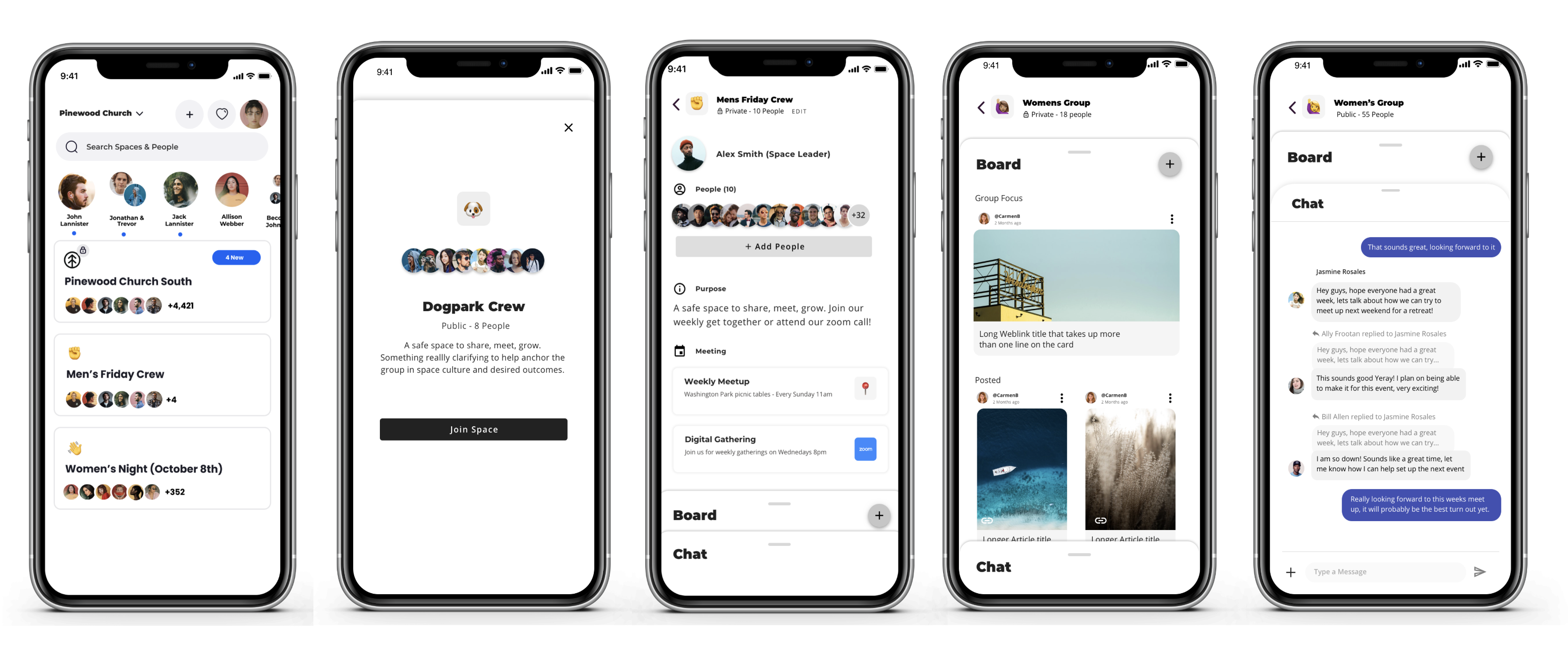
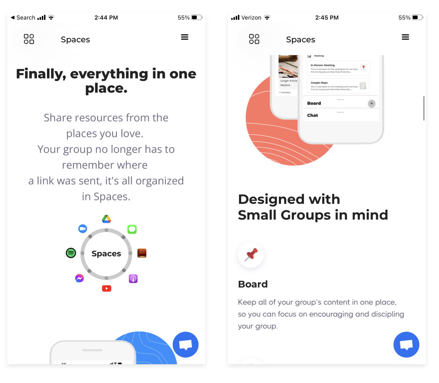
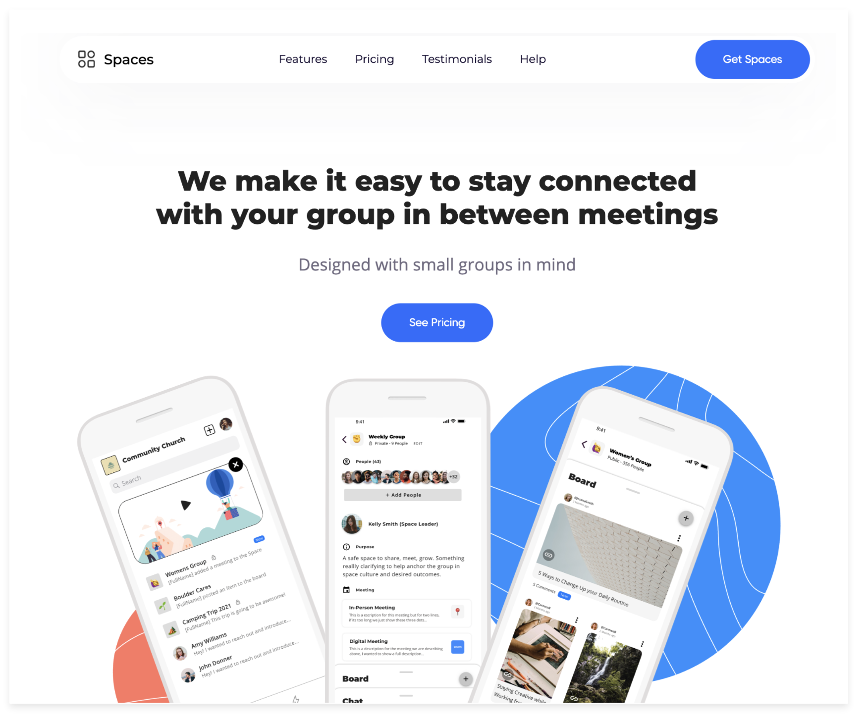
The problem & the solution.

Individuals wanting to grow either personally or professionally desired to feel connected to their community. They collaborate around key topics to enrich the lives of others.

However, current digital tools don't orient users to small group resources, nor do they allow for in-depth communication around key topics. Users have to juggle multiple tools.

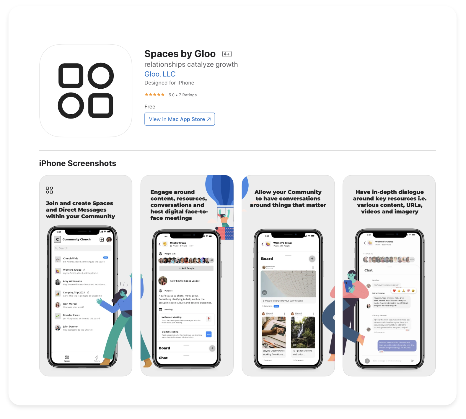
Solution: An intuitive application that lets organizations create digital communities and foster growth through small groups — where participants connect to the right people, find easy-to-locate content, and step up to help others grow.

Spaces wireframes and sketches
02

Product timeline, 2013 → 2022.

2013Gloo Polymer 2.0 — Visual Designer, in market with 20+ orgs as LMS
2017Research & Alpha — Mobile Co-UX, JTBD, native iOS & Android
2019Gloo Engagement 1.0 — Original research and market evaluation
2021Spaces by Gloo — Mobile UX Lead, Beta in market, single Flutter codebase
03

Road to early access — iterate to address user problems.

Met with end-users from 4 key organizations. Ran 30+ moderated usability labs and gathered 50+ UsabilityHub survey responses. Simultaneous sprints with engineering and product.

Launched beta with 18 organizations and 4316 active users.

50+
Moderated usability labs.
4316
Total active users at beta launch.
18/18
Groups onboarded against quarterly objective, with time left.
Wireframe sketches
Usability test results and heatmap
Whiteboard sketches and post-its
Wireframes and user flows
04

Evaluative learnings.

Initial offering focused on desirability of feature sets. As we gained a larger user base, we shifted into general feedback and increasing usability of the product holistically — improving performance, increasing user help, reducing inconsistent patterns.

We learned that users found a "tab" structure for information architecture easier to use after 2 months than upon initial usability tests — leading us to update the structure of a "Space" so users could complete tasks faster.

We also learned of large user failure on initial onboarding steps. We began experimenting with abbreviated and segmented onboarding strategies to increase completion.

High priorityUsability — is the feature easy to use?
High priorityFindability — can users find what they assume is present?
High priorityDiscoverability — will users find features they don't know about?
ModerateComprehension — does our copy convey what we intend?
ModerateDesirability — does the user want or need the capability?
ModeratePreference — do users prefer one design over another, and why?
05

Latest product examples.

Spaces mobile app screens
Spaces by Gloo — mobile screens
Spaces admin dashboard
Spaces admin dashboard analytics
Help Center Notion page
Help Center walkthrough
Usability research sprint schedule
Back to index

Selected work.